Pages
▼
Friday, August 24, 2012
New Microsoft Logo
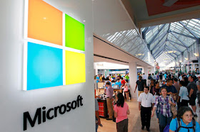
I actually like Microsoft's new logos, and think they work. The Microsoft logo is clean, simple, modern-metro, friendly, soft, and lends itself to many applications. It plays on its old "window" logo, but eliminates the flag-like warp and gradients. They create brand recognition by four colored rectangles, which speaks volumes. It reminds me of a quick thought I had about the Mickey Mouse logo being nothing but 3 black circles.
The new Windows 8 platform, like the logo, is cleaner, simplified, and uses squares in much of its interface design. Its design is competing with Apple's as much as the companies are fighting for each other's audience. The new Microsoft store showcases some of the implementations of its new elements that I believe will age a lot better than any of their previous logo designs.
Read Article on Microsoft's new logos


No comments:
Post a Comment